
There are icons that users don’t like. They say that the icon is unclear, ugly, or simply cannot explain what they dislike. The reason is simple — in such icons, one or more fundamental principles of their construction are violated. The information in this article can help you avoid mistakes and create icons that users will definitely like. The principles are relevant to both website and application icons and can be applied to all types of icons.
Let’s start with some basics. Icons in web design are small elements only in size, but not in importance or significance. They are needed to indicate information. These are visual anchors that help capture the user’s attention and direct them to perform the targeted action.
- attract attention;
- understand the meaning;
- navigate the interface;
- save visual space;
- make a connection with the user.
The usage of icons is not as easy as it seems at first glimpse and requires design competence and a thoughtful approach. (It’s good if a separate specialist deals with icons.)
The biggest worry of some designers is whether or not their icons look neat, are correctly centered, and whether the pixels are perfectly matched. They align elements according to formulas but forget the most important thing.
What are the most important principles for creating icons that everyone likes?
Users don’t like complicated things.
A good icon should be simple and easy to “read”. It doesn’t need a textual explanation. You can test the icon by showing it to a person far from design. If they haven’t guessed what it roughly means, there is probably something wrong with this icon.
Key enemies of simplicity:
- excess elements
- unnecessary detailing
They hamper perception, distract, and confuse users. As a general matter, the fewer elements the icon contains, the better. An icon with 3 or more colors stops being a pictogram and becomes an illustration.
A pile-up of elements and color accents makes the icons visually undifferentiated and unclear:

Excessive details don’t make the icon clearer, but, on the contrary, make it difficult to perceive:
A lot of emphasized and small elements also sets off the simplicity:

The detailing of the icons should be reasonable.
Don’t think that detailing is some kind of evil, and the saying “The devil is in the details” was invented by web designers. Yes, any detailing makes icons complex. However, it’s justified if it matches the design concept and is made professionally.
For example, your goal is to get the user to look at the icon narrowly so that they stay on the page for a while. Then the detail makes sense. In most cases, users don’t tend to strain their eyes and cannot “read” a complex icon on the fly.
There shouldn’t be a lot of detailed icons on the page. Don’t place them too close to each other. The background for them must be sole-colored, and the color palette — limited.
For beginners, we would not recommend starting with detailed icons. Their creation requires solid experience, artistic taste, and mastery.
Users don’t like things they don’t understand.
An unclear icon needs to be “decrypted”, and users don’t like it. If it doesn’t have any meaning, this is also a big disadvantage. The main purpose of the icon is to instantly convey information. Therefore, our task is to remove all unnecessary things that prevent it from doing this.

Users don’t like interface elements and even are uptight about them. Therefore, it’s very important that the icons are easy to “read”. The recognition of icons depends on their simplicity, comprehensibility, and metaphoricity. However, there are different types of simplicity. Simplicity is not a guarantee of clarity. You can simplify the icon beyond recognition.

Excessive simplification or, on the contrary, the complication of forms can make the icon unclear to the user.
Don’t take advice in the style of “solid icons are easier to read” seriously. Any well-designed icons are easy to read.
The size of the elements also affects the recognition of icons. The more small elements are there in the icon, the more difficult it is to understand what it symbolizes.
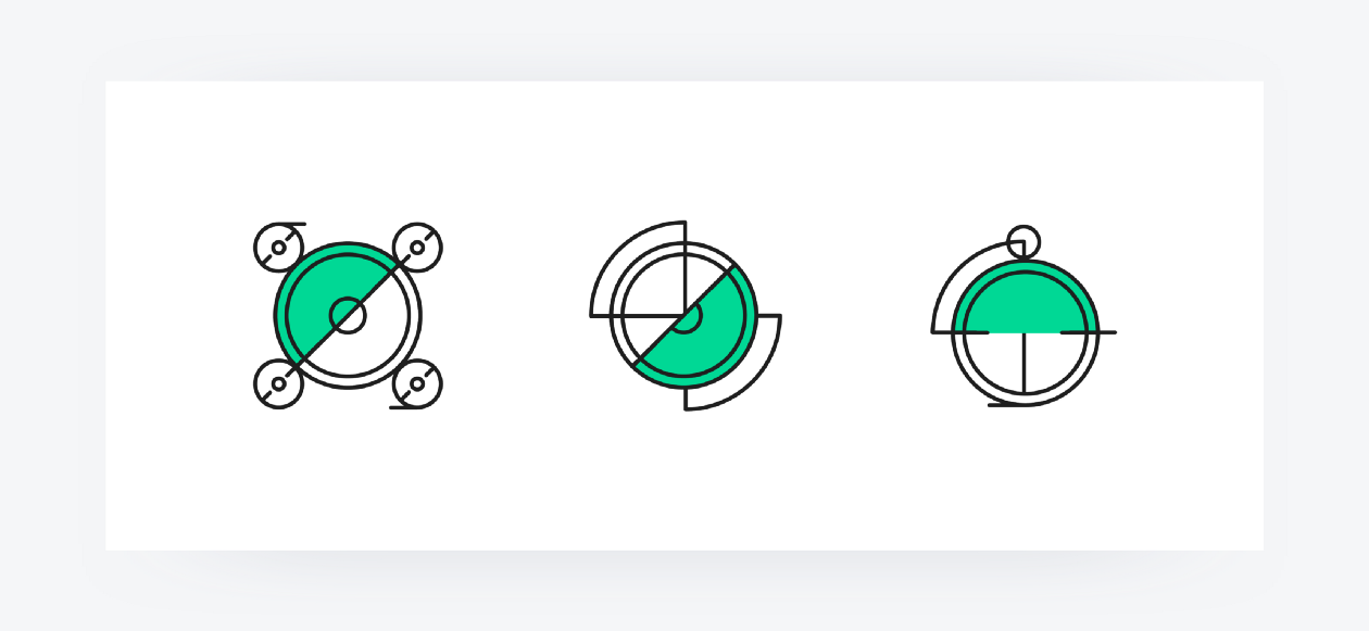
An example of a poorly made icon:

The shape of the first icon doesn’t evoke the necessary associations, and small elements hamper its recognition. The sizes of these elements don’t correspond to the sizes of the other two icons, line thickness and color also differ. Here is a violation of the stylistic unity, the absence of a suitable metaphor, an excess of small elements. All these are the reasons for the “illegibility” of the icon.
Good icons are universal for people of different cultures, ages, and backgrounds. However, you should study your target audience and choose the colors and metaphors that are most appropriate and understandable for this group.
Suitable metaphors guarantee that icons are clear and informative.
These metaphors are clear even to a child:

And here’s an example of puzzling icons:
Users don’t like meaningless things.
In a creative outburst, designers love to create beautiful but meaningless elements. This approach deprives icons of their main function: to instantly convey information.
However, sometimes an icon must visualize a complex or abstract idea for which it isn’t easy to find a metaphor. In this case, it’s permissible to make the icon abstract and convey the meaning using text. An example from our case:

In this situation, icons are eye-catching anchors, while the necessary information is conveyed through text with large fonts.

The use of icons that don’t contain metaphors is possible if the icons are needed only as visual accents that balance the design, and their informativeness is supported by the text. However, even in such cases, it’s desirable to find suitable visual associations.
Users don’t like disharmonious things.
This is the case when people can’t explain what they don’t like about the icon. We all feel disharmony intuitively. The path to harmony lies through the unity of style.
The unity of style suggests that the icon design matches the brand style and design concept.

Icons should reflect the essence and values of the brand, be its organic part, not only visually, but also psychologically. A brand’s style can be perceived as tough or soft, luxurious or economical, formal or intimate, elite or democratic, etc. Icon design must in the first instance meet the requirements that the brand dictates.
Unity of style supposes common parameters for a set of icons, such as:
- consistent color palette;
- graphic and typical unity (raster or vector, 2D or 3D, solid or outline);
- equal size;
- equal line width;
- equal visual weight;
- equal balance of elements;
- the same level of detailing;
- uniform principle of emphasizing;
- uniform rhythm, static or dynamic character;
- identical shadows (if any);
- compliance with the logo style and overall design concept;
- visual correspondence to the fonts.
Designers often have to use icons from ready-made collections on the web or take them as a basis. However, the collection may not have the necessary icons, and it’s necessary to create them yourself. A common mistake is that your “own” icon differs subtly from a set. The reasons are violations of one or more of the abovementioned parameters of unity.
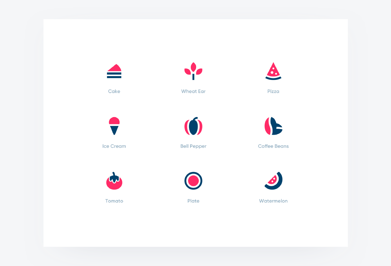
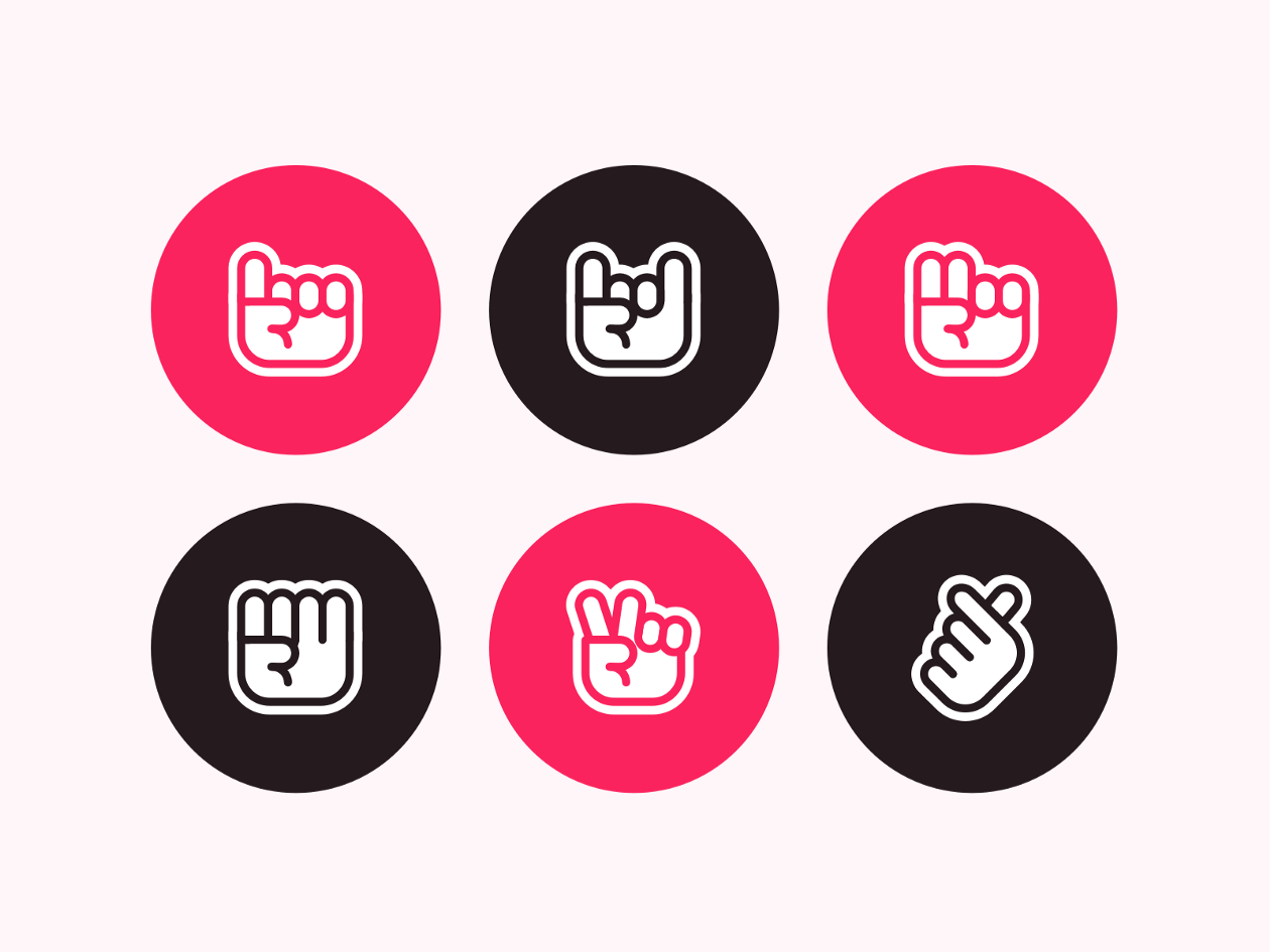
Icons made in the same style:

Unity of style is not only a tribute to the aesthetics and support of the brand’s style. The consistency of style makes the perception of the icons easier, simplifies navigation, and contributes to positive user experience.
More on this topic: Unity of Style in Web Design
There are two types of uniqueness — the uniqueness of the icon set and the uniqueness of each individual icon.

The first type of uniqueness hardly needs any explanation. This is a design that allows to distinguish a set of icons from many similar ones, to make them special, interesting, and memorable. The uniqueness of the icons contributes to the uniqueness of the brand.
Uniqueness doesn’t mean that you need to create icons that the world has not yet seen. You can’t imagine a better way to frighten the people away. Internet users are used to certain standards and stereotypes, and breaking them is a bad idea. These stereotypes limit creativity, but make UI elements predictable and understandable. People shouldn’t strain themselves in an attempt to comprehend what they saw and waste time solving rebuses.
Use metaphors that are familiar to everyone, but make their visual implementation unique. Users don’t want to decipher riddles.
Simple icons (stickers) with a unique realization:
The uniqueness of an icon should be understood as its difference from its neighbors in the set. In striving for unity, designers sometimes sacrifice the most important thing — the meaning of the icon. It shouldn’t be forgotten that unity and monotony are far from the same thing. Each icon has its own purpose. (The slogan of a modern icon designer is E.I.M. — Every Icon Matters.)
A beautiful set with visually indistinguishable images won’t be appreciated or understood by users. People become embarrassed, unable to distinguish one icon from another.
“Unified” does not mean “the same”!
An example of a design with visually identical elements (uniformity of style is maintained):
This point is a special case of point 3 “Unity of style”, but deserves a special mention.
Optically unbalanced icons are the icons that users don’t like at first glimpse. People feel imbalance intuitively and immediately, barely looking at the image. Errors in the alignment of elements also refer to balancing interferences. However, despite all the importance of the alignment of elements, minor irregularities in their alignment aren’t the main reason that the icon is visually unpleasant. In many cases, errors in alignment and centering are not the cause of imbalance.
The balance is disrupted due to the disconformity of shapes and color emphasis.
This is the first thing that strikes the eye of users, and not the shifting of an element by a pixel or two.

Related articles:
Balance in Composition: How to Balance Design?
Emphasis in Design. How to Draw Attention
Designers know very well how many requirements are imposed for icons. For this reason, they are ready to improve them endlessly, polish every detail, and count every pixel. We in no way call not to do all this. We just want to say that these efforts are meaningless if the fundamental principles of creating icons are violated. And namely the following:
- Simplicity and clarity;
- Metaphoricity (and therefore informativeness);
- Unity of style (and therefore visual harmony);
- Uniqueness of design and individuality of each icon;
- Visual balance.
Following these principles is the guarantee that your icons will be clear, aesthetic, and functional. This means that everyone will definitely like them!
Always happy to help,
The Outcrowd team.