A hierarchy is the placement of elements in order of importance, putting the parts in order from the highest to the lowest. The interface hierarchy includes the creation of a structure in which the sequence of visual processing of information is subordinated to the conceptual hierarchy of the site.
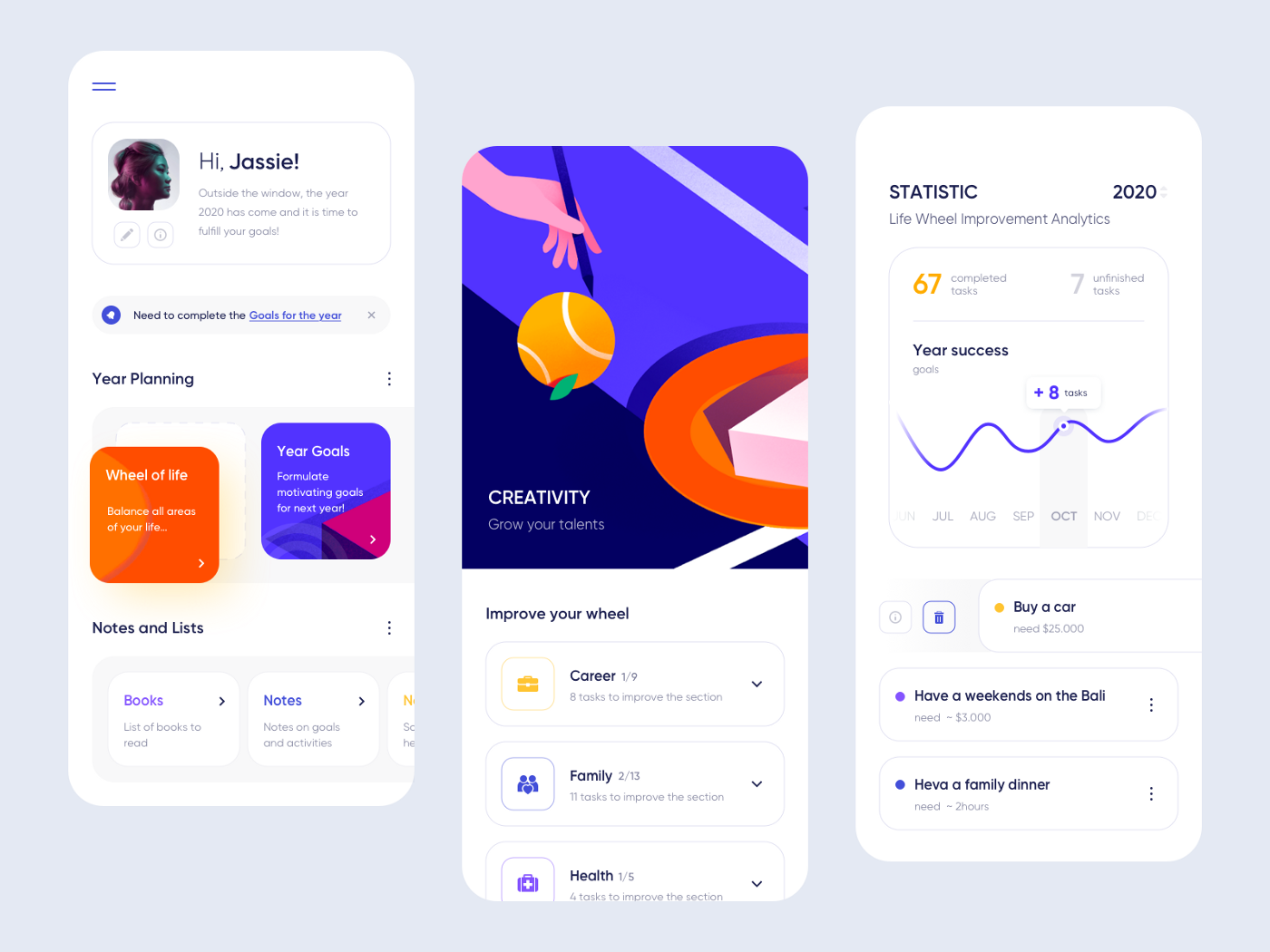
The hierarchy makes the site understandable and convenient for the visitor. It’s clear at first glance, where what is located, which buttons to press, where to go, till which section to scroll. Hierarchy allows you to focus on the main thing. By taking the user to a journey through the page, it becomes his invisible guide.
Analysis of the content helps to rank the information. It should be done at the draft stage. When the content is organized and structured, you can build a visual hierarchy.
During a few seconds, the visitor should discover the most important information, be minded to stay on the page and direct his attention further. He wants to quickly get answers to his questions:
What is it? — Helpful information!
How to use it? — Simply and easy!
Why do I need it? — I can’t do without it!
Hierarchy helps to cope with all these tasks. In what way?
All the methods and tools of our composition should work for the hierarchy. All and everything obeys the order of priority!
It’s necessary to create a focal point that instantly draws the user’s attention.
The focus area contains significant information, a call for action, a fill-out form, etc.
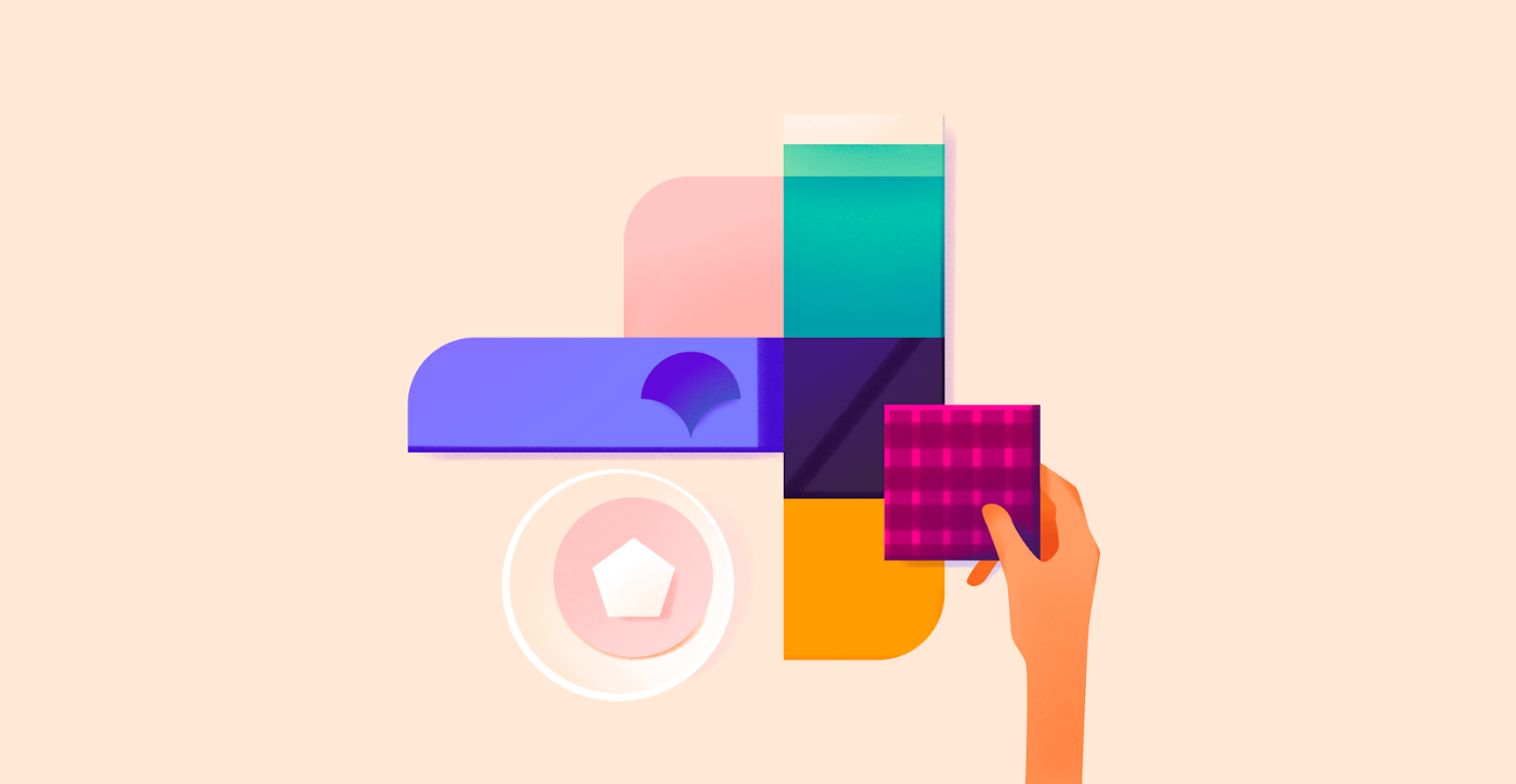
The tools for creating an emphasis are color, hue, size, contrast, rhythm, movement, position, free space, typographics.
All layout emphases comply with the principles of hierarchy. A clear allocation of priorities helps to place emphasis only on the most important things.
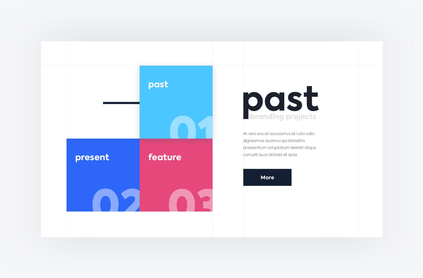
It’s commonly known that the trajectory of the gaze on the screen resembles the letter F or Z. Therefore, priority information should be put in strategically significant places on the page. What can be done tо achieve that?
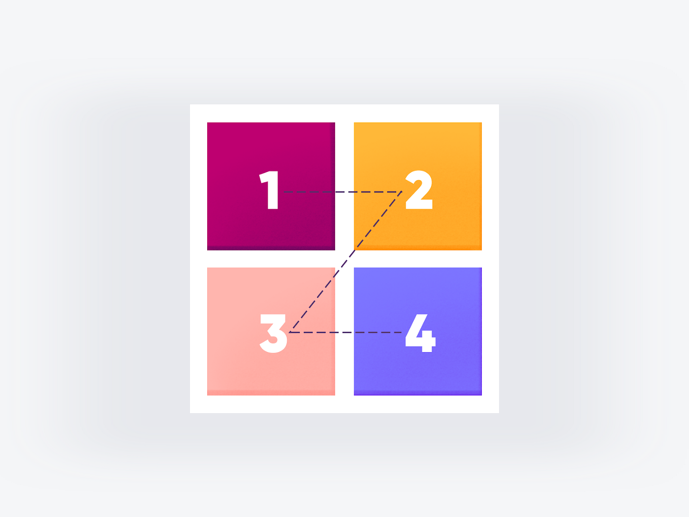
1. The top left — priority viewing area. The most important information — the logo and slogan — should be placed here. If it’s the text content, then use the first 2–3 words of the title.
2. The upper right is a well visible area. The user directs his gaze horizontally, his attention weakens, but the person is still concentrated. Here you can place other important information — contacts, callback form, address, offer.
3. The lower left is the least explored area. The look is shifted here literally for a fleeting second. Users almost don’t pay attention to the information located here.
4. The lower right is the exit zone. Here the user decides on the completion of the target action: continue reading or leave the site. A call to action or order button is placed in this area.
You can direct the user’s glance either by taking into account the Z and F patterns, or by breaking the molds, depending on our goal. Color spots that create movement, dynamic lines, repetition, scaling, pointers, arrows, etc. serve as directions.
1. If there is a text over the image, it will catch the eye.
2. The faces of people and anthropomorphic animals immediately attract the user’s gaze. He longs to the same place where these people (anthropomorphic creatures) look.
3. The eyes of the viewer always follow the movement: who goes where, where something is thrown, where is the gesture pointing.
4. The human eye notices contrast instantly, especially color and size.
Any methods of directions should work for priority: to direct the attention of the viewer to the main thing, and then help his look go to the secondary. Directions lead the user through the page and don’t let his interest fade away.
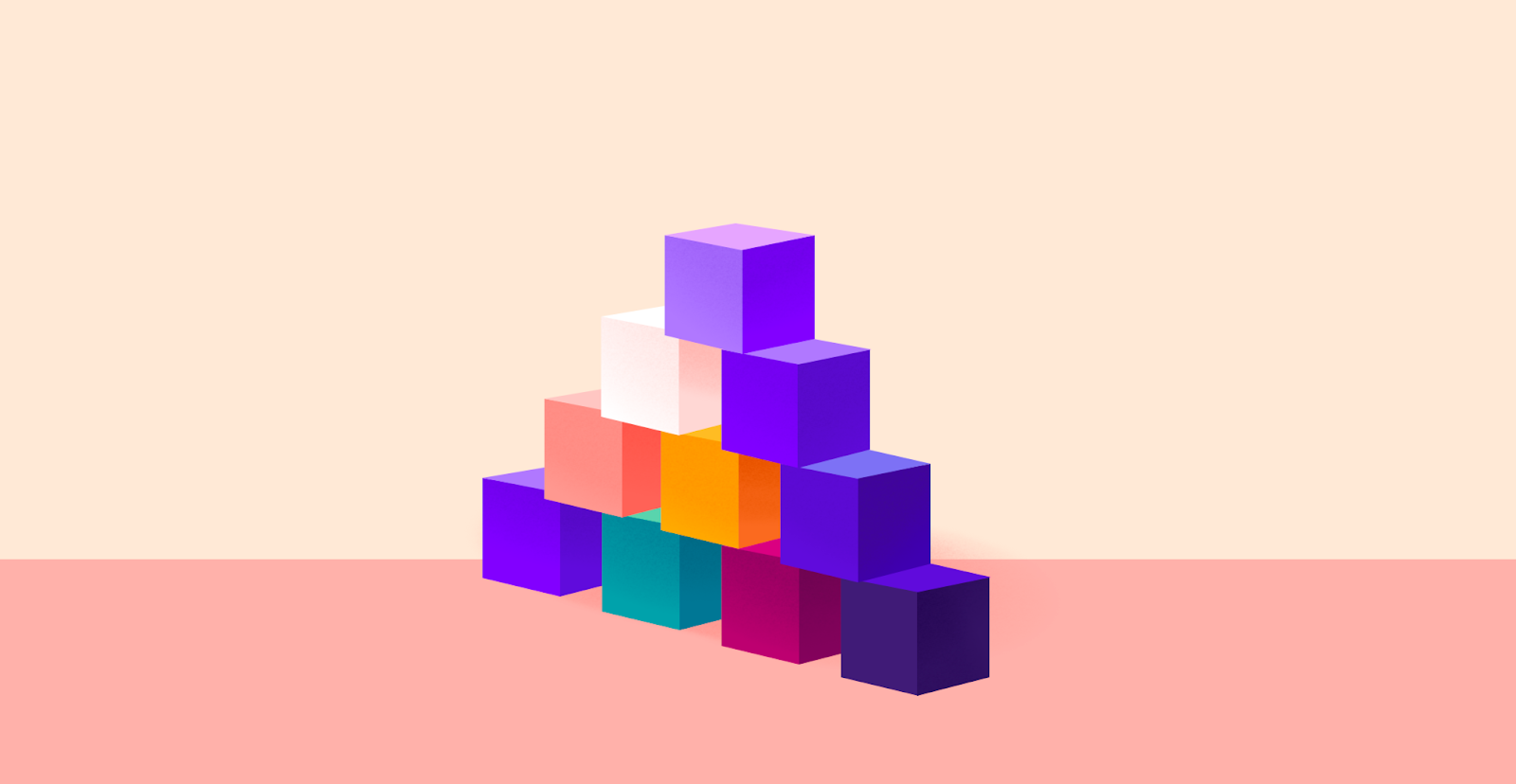
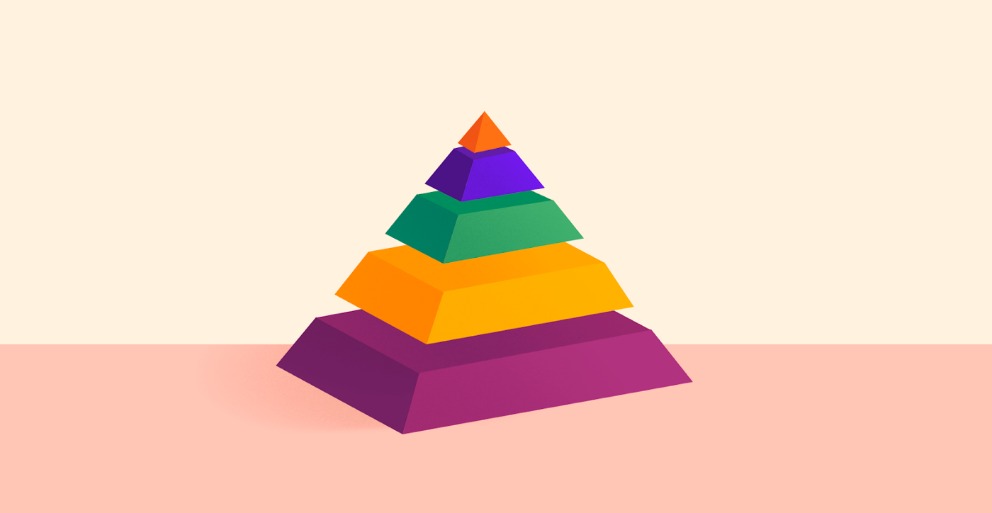
Big objects always attract more attention. Using size is an effective way to capture the eye and let know that the big is also important. The sizes of objects help to show what is primary and what is secondary.
With the help of the color you can emphasize the main thing and balance the placing of elements on the page. Colors have their own hierarchy, depending on their ability to draw attention. For example, black and red are catchier than white and yellow.
Like other tools, color in design should work for priority.
Unfilled space between images, text, and other elements is a useful tool in the hierarchy. Therefrom depends, how easily the information will be acquired. Space allows you to:

Typographics is a powerful tool for building a visual hierarchy. Any design in which there is text can’t be complete without a visual hierarchy of semantic blocks.
Headings help structure the content on the page. Most headings have three levels of perception.
All composition methods and tools should work for the hierarchy. Form, color, hue, contrast, size, balance, movement, typographics — everything should serve the principle of priority.
The musicians in the orchestra each play their part, on different instruments, but everyone obeys the director. The hierarchy, as a conductor, subordinates design to its rules and makes it beautiful and effective.