
Any designer wants to know how to retain users through design. Is there a way to do that? You try to find answers, but all you get are marketing tips. They certainly have their value, but not everyone has time to get bogged down in theory, especially with the deadline looming.
So let’s get right to it. There are effective methods of user retention that are applicable to websites and apps. They are not my own invention, but I’d like to share with you a simple and efficient way to use them. Let’s call it the Board Game Method.
This method lets you immerse yourself into the user retention cycle, focus on problems, and find ways of solving them. Ideally, it should be employed at the concept stage, before or during the development of user flow. The sooner you start thinking about user retention, the more impressive the results will be.
Here’s what it is about: imagine your task as a board game. You know that illustrated gameboard where you have to reach the finish by following the squares? The player uses a token to reach the goal. He or she solves various tasks, receives boosts, and achieves victory by reaching the goal before other players.
Use a sheet of paper or a tablet, whichever you prefer for drawing and making notes. You can even use real game tokens.
The player is the designer, the token is the user. Here’s our gameboard:

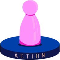
There are five main points in the game: Trigger, Motivation, Action, Reward, and Investment. The objective is to move the user through these points in a way that is enjoyable and invites another replay. Your knowledge of the target audience, the product, the company’s goals, and all the other input data is a given.
Once the task in the first point has been solved, the token moves on to the next one, and so forth.
If your project is not meant to be habit-forming, the token completes only one cycle. For instance, an automotive landing page does not need to be habit-forming, as it has other goals. However, any landing page with 4–5 points will have higher conversion rates. So a website or app that strives to build a loyal customer base should encourage the user to repeat his/her experience, i.e. complete more than one cycle.
All right, let’s start: put the User token on Trigger.

Triggers are incentives that motivate the user to follow a specific scenario. Triggers work by engaging human emotions (although engaging reason can’t hurt, either). That’s why you need to research your users: otherwise you will never get to them emotionally. Triggers are a way to establish emo contact with your audience. UX is the foundation this contact is based on, while UI is the visual magnet. It’s a pyramid that should be built from the bottom up, starting with the concept. Visuals are the last thing for the designer to worry about. They are, however, the first thing the user will see. Bad visuals can undermine a beautiful idea and trigger the wrong emotions. Good visuals may not trigger any emotions if they do not contain anything that engages the users.

Unless it engages the user or solves his/her problems, it is not a trigger.
Read more:
- Necessity & salience (basic trigger, a straightforward sales pitch: here’s what you need [a product] and here’s how to buy it)
- Reciprocation (the user gets something useful for free: assistance, consultation, test drive, demo version, story, manual, recipe, game, webinar, video, etc.)
- Curiosity (an incentive to perform some action, such as check the mail, reply, subscribe to a mailing list, share a post, buy a product, learn more, etc.)
- Novelty (new information or product: an attractive product always maintains a certain degree of novelty, suspense, and variability)
- Argument (a clear explanation of the product’s purpose and its ability to solve the user’s problems; dispelling doubts).
- Social proof (testifying to the quality of a product or service on social media and in traditional media outlets, documents and certificates, appeal to authority, user reviews, photo and video proofs)
- Mass appeal (showing that the product is enjoyed by the majority, ergo it is good and useful) or, conversely, Exclusivity (something unique and custom-tailored), depending on the needs of your target audience and project goals
- Team appeal (“How come you still aren’t with us?”: a call to join a likeminded team, a concerted effort to solve a common problem)
- Scarcity (oh no, the sale ends tomorrow!)
- Fear (the rust virus is loose and you still haven’t insured your car!)
- Comparison (“before & after,” “expensive vs. cheap,” “bad vs. good” in favor of the new offer)
- Storytelling (a trigger that engages and encourages action if done right)
- Knowledge & growth (offers of education, intellectual, physical, and spiritual self-improvement)
- Entertainment (one of the most effective triggers that has manifested in the recent trend toward gamification)
Once you have selected the appropriate triggers, it is much easier to see how to make the best visualization for your target audience.
In design, triggers are always visually highlighted.
Designers have many different tools for user engagement and retention in their arsenal. UI triggers are the visible outer shell of UX triggers. They are visual magnets and highlights on the visual path. Highlights must first and foremost be functional; aesthetics are secondary.
- motion (not just animation, gamification, or video, but any dynamics: lines, color spots and shapes, rhythm, scaling, progress, etc.)
- color and lighting (brightness, contrast, saturation)
- text as content
Sound or melody is also a special kind of trigger.
Read more: Emphasis in Design. How to Draw Attention
Now move the token to Motivation. This focuses our attention on an important issue: that of choosing incentives for our target audience.

We have captured the user’s attention and are retaining it, but it’s slipping with every passing second. To avoid losing it, we will create “incentive points” that reinforce motivation. Their number will depend on your project. The longer the path to the goal, the more points you’ll need.
Here are some possible incentive points:
- The “Why? Because!” block (once the emotions fade, it’s time for logical reinforcement)
- The “How does it work? This is how!” block
- Wow! (interesting info or visual effect)
- Help or Tip (a popup or a mascot helper)
- Useful microinteractions
- Control and customization (a chance for the user to take charge, such as changing the settings to his/her liking)
Lifehack: Have you chosen the main trigger for your audience? Now use other appropriate triggers from the above list as incentive points. For example, if your main trigger is Novelty, reinforce it with Arguments (explain why the new app is better than the old one) or Scarcity (the new thing is awesome but there’s not enough for everyone). The main trigger is always the visual centerpiece. The other incentives must be subordinate to it within a semantic or visual hierarchy. Don’t overuse incentives. It’s better to have a couple of strong points than a dozen smaller distractions.
All the incentives must encourage the player (user) to make the next move — from Motivation to Action.
To make this path logical and simple, you should:
- minimize obstacles and distractions;
- increase user engagement;
- use visual guides;
- simplify the way toward the goal.
Do you think the user is ready for the next move? If yes, then move the token forward.
Usually, the first usage cycle of a digital product requires some effort on part of the user. Many people aren’t sure yet if they really need this product and are reluctant to spend time learning how to use it. It’s at this stage that most potential users leave. And that is why the Board Game is so useful: if you have done everything right in the Trigger and Motivation fields, the user will not want to leave at this point. This is the peak moment for the user, where he or she is itching to act or at least willing to try it.
Here are the questions you need to review at this stage:
1. What potential obstacles may users encounter on their path between Trigger and Action?
2. Can this path be simplified?
3. Is there a shortcut and should it be used? (A path that is too short may have too few incentives and points of contact.)
4. Should the product be adapted to each of the possible use cases?
5. Is there anything that can restrict the user and prevent them from performing the action?
6. What doubts may plague the user at any given point? How do you dispel them?
7. What are the possible user paths from Trigger to Reward?
Reward follows immediately after the action is performed. If you have answered the above questions (meaning you know how to deal with them), move the token forward.

Move the “User” to this spot and think about what would be a fitting reward for them. The exact reward depends on a variety of factors: the personality of the user and their potential expenses and investments; their values, desires, and preferences; the objectives and tasks of the website or app; the company’s willingness and capacity to motivate users not only with token medals but actual discounts, gifts, or access to certain functions.
The rewards are as important as the triggers and motivation, if not more so. It’s better to let a professional marketer choose them. If this option is unavailable, the designer will have to put themselves in the user’s (or rather, multiple users’) shoes to make the right choice. Consider all possible kinds of large and small rewards. Think of desirable and unexpected rewards. Any rewards should be used sparingly and purposefully. When there are too many easily obtained bonuses, users will stop perceiving them as valuable.
Most habit-forming products utilize variable rewards.
These questions will help you choose the appropriate rewards:
- What types of rewards (social, trophies, intrinsic) can be used in your product?
- How important and significant is the reward to your user?
- What needs of the user should the reward fill?
- What kind of reward can do it?
- How soon will the user want to receive it again?
- What will the user do with the rewards? Will he/she want to collect them and exchange them for something useful?
- Will the user be able to share the rewards on social media? Will he/she be interested in other users’ rewards?
- How will the reward and the product interaction experience be different a day, a week, a month later?

You don’t need to go into details at this stage. The important thing is to understand its significance. This is an essential part of the cycle. Any weak or wrong reward, and the token will leave the cycle. Once you have some reward ideas, move forward.

Investments strengthen human relationships and reinforce bonds. The more energy, talent, time, and money we invest in a relationship, the more valuable the other person becomes to us. We are reluctant to let go of a kitten we have just fed. We love the garden that we planted ourselves. Guess why people like IKEA furniture? Because they assembled it with their own hands. If you can succeed in making your user “invest” in your product, they will stay with you.
What do we mean by investments?
This can be a group of followers, an achieved ranking, selected content, saved files and photos, messages, a collection of bonuses, rewards, and so on.
This is why users find it hard to leave social media: too much value has been invested, too many emotional bonds forged, too much time spent. Leaving would mean devaluing all the achievements, losing something treasured and important.
Learning to use a product means acquiring a skill. The user spends time and energy, which is an investment. And no, they are not willing to just throw it all away!
These are any tasks that the user has devoted time and energy to. If the user can also see his/her growth and achievements, they will find it especially hard to leave.
When the user changes settings, sets up a profile, or leaves his/her contact information, he/she is also making small investments.
These questions will help you figure out investments:
- What investments will your users need to make?
- How will these investments aid user retention?
- At what point should these investments be put to use?
- How do you integrate investments into product use, so that they can be accumulated in each usage cycle, starting with small investments and gradually increasing their value?
You and your token have completed all five stages. Take a break and then replay the whole game again and again. You may get new ideas and solutions.
The ideas you come up with at each of the five stages should be noted or sketched right there in the corresponding fields. You can use color-coded tokens for different target groups.
Obviously, none of these tasks are simple. But the Board Game will help you see them from a new angle and stimulate your imagination. By stopping at each point, we focus on finding the best possible solution. The player becomes the user and acts in his/her best interests. The Board Game Method helps designers understand exactly what they should control and how much depends on them.
This is how designer ethics is born: out of mindfulness, love for your users, and a desire to build a better product for them.